Wednesday 16 February 2011

Evaluation - How did you use new media technologies in the construction and research, planning and evaluation stages?

The new media technologies that I used were; Final Cut Express, Mac, Cameras, Zamzar and the Internet.

In the construction of my film I used my mum's camera to take the images that are shown on my film. I used a photo camera rather than a filming camera because as I was taking pictures
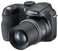
it made more sense to use my own rather than
have to wait to borrow a filming camera from the college. This also meant that I could be more free with my photo taking and I wasn't set on a short time limit where I had to have my photo's taken by because it was my own camera and I wouldn't have to share it
with anyone. The camera I used was easy to use because as it is my mums I have used it before and therefore I was familiar with it and didn't need to spend time getting my self familiar with it. I also used a tripod to make the camera steady. This was useful because it meant that I was able to leave the camera on its own to tamper with the characters to get them into their next position without making the camera line move and make the images appear to be shakey.

To put my film together I used an IMac. I used this because it has a lot of programs that other computers don't have (such as final cut).
These programs helped me a lot with the making of my film because they were simple to use and really made it look more professional.
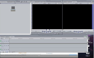
Final cut was the main program that I used, this was because it is easy to use and on it you can cut and edit bits of film (or images) and make
them look better than they did before.

For both of my ancillary tasks I used photoshop which enabled me to edit my pictures easily, change the contrast and brightness on them to make them look brighter and also to add the titles to them easily. I first tried doing this on paint but the resources weren't as good and the final product that came out of it didn't look nearly as professional.
Most of my lighting that was used for my film was artificial as I had to use a spot light that could shine directly onto the set to make it
seem more like a 'fairytale'. This was useful because I didn't have to be worried about the sun going down and ruining a shot. I also didn't have to worry too much about shadows changing dramatically in shots because, as I was moving arms etc. frame by frame, it would have made the shadow of the characters look as if it was moving very fast and some times disappear.

For the music I used the internet to get the song from Youtube.com and then went onto a website called Zamzar to make it into a mp3 format. This was easy to do as it has step by step instructions on it. This also meant that it was easy to get the music from the mac onto final cut because it kept coming up with error messages when I tried to upload the one I had on itunes onto final cut.

For my blog I have used Blogger.com (this website). I personally think it is a good blog to use because it is simple and doesn't take a lot of work to use as it isn't complicated to upload images onto. I was also familiar with it because I have used it before with my own personal blog.

Evaluation - What have you learnt from your audience feedback?

For my audience feedback I asked the people in my class to fill out a questionnaire about my film to see what they said I could do with it to make it better and more interesting. The questionnaire is shown in a picture on the left.

From this I learnt that the audience really liked the beginning of my film where I imitated the title sequences of Dream works and Paramount. They also pointed out to me that the music was slightly off from the actual footage so I was then able to set that right (without my audience feedback I wouldn't have found that out). They also thought that the expressions on the characters faces were good but they also said that it would have been better if the characters were able to talk (this as I already stated may have been possible if I had more time but then it would have taken me probably a couple months longer to actually complete the film.) They also said that they think the music really went well with the film in most of the dramatic points and some of them recognised the music and thought that it was really clever that I used music from a different film and put it into mine, because it made them wonder what film it was actually from and then they also thought that the music was clever in the way that it looks like it was made for my film.
Most people enjoyed my film and thought it was between excellent and good, however a few said that the film was average because they expected "smoother" movements from the characters and better features. Whilst on some level I agree with them, I think that it is unrealistic to expect me to create a film on the same standards as professional film makers.
My audience feedback helped me improve my film by tweaking certain things within it such as slight delay in music and things being jumpy. I don't think that without my audience feedback my film would have been as good.

Evaluation - How effective is the combination of your main product and ancillary tasks?

Both of my ancillary tasks (my review and my film poster) have a strong correspondence with my short film. This is important for films to be successful because the film review has to show insight into the film and also it has to predict what families will want to see from that film and also if it is any good or not. Film reviews are also important because they help the film get noticed, especially by people who regularly read film reviews. This is because they create a form of advertising and since my film review is 'singing the films praises' it would create a positive advertising campaign and get more viewers. Film posters are also important as these are one of the main ways in which films get advertised (the other being TV adverts and radio). It is important that the poster is eye catching and lets the viewer know roughly what the film will be about, I think that my poster is very eye catching because it has contrasting colours (green and purple) and also it tells people a little bit about the film but also doesn't give too much away.

I think that my poster is good because it looks very clearly like a film poster for a children's/family film. I think this because it has very bright colours which would attract a
child's eye and also looks wholesome so that parents wouldn't mind seeing it. The font was decided by some people that I asked in my class by asking them which font looked best on the actual poster. I chose a dainty font that was called "Holiday Home" (shown on the right) which the rest of the class really liked but it didn't show up very well on the actual poster so they chose a 'plainer' font that is shown on my actual poster (below). A poster needs to show a basic image to catch the viewers attention and the text on the poster has to be short and interesting so people wont get bored standing there reading it. My poster did this because it had a simple image of a person looking through some leaves and then the title and also a caption saying "what's in your garden?" this makes the viewer wonder what will happen in the film.
On the other hand, I also think that if I had the chance and the resources I would improve my film poster by making the lines on the plasticine on the poster smoother and less visible making it therefore more professional. I would also have liked to experimented more with the colours and also different ways of making my film poster.

I think that my film review is also very good because it was kept in the same essence of a real film review that was found on the website listed below. I think that the film review was good because not only did it have good descriptive words that parents would appreciate but it also appealed to the children because it had a clear 'star' system so that it was easily rated and that children could understand it. I think that my film review was also in keeping with my film because it was colourful and also made it seem family friendly. However, if I could change my film review I would probably make it a little bit longer and have more to say in it. I would also probably make it seem a little more professional with better wording.

Evaluation - In what ways does your media product use, develop or challenge forms and conventions of real media products?

- I think that my media product was similar to real media products in the way that the main features of real life animation films are that there is intertextuality, realistic settings made surreal, music to back up what is happening in the film, human characters and animal characters.
In almost every animation film that has been produced within the last decade has had all of these factors, this is true in cases such as Chicken Run where it had intertextuality where it was constantly related to The Great Escape where Ginger would chuck a ball against a wall and also the music that went with the whole film was similar to that of The Great Escape. Chicken Run also had realistic settings through the chickens living in a chicken run that looks similar to a concentration camp but then making it more child friendly by making everything look like it is where chickens are meant to be but with humanistic things attatched to it. For example the characters having blankets over them when they sleep, that they have posters up and teapot's and other things of that nature. Chicken run also has both human and animal characters, the human characters fit into a typical type that animation characters usually have, for example they have big features such as a big nose or eyes and the animal characters have similar features to the humans in that they have overexaggerated features and are humanised by making them have human expressions and making them wear human clothes etc.
My film was similar in this way as to that my characters had abnormally round eyes and simplistic clothes and features, however since I only had one animal character (the frog) and my film didn't include talking, I couldn't really have the frog look more like a human. However the frog did have human expressions when it looked shocked and started to cry. I didn't have intertextuality in my film that I could use it because I think that it would have looked odd if I put it in there and it would look out of context. I think that my film stuck to the convention of the music because I used instrumental music that fit really well into my film and emphasised what happened in the action of my film. Since I don't write music however I couldnt have a score that was specifically written for my film. I think however that I did have a recogniseable theme tune but for a reason that isn't to do with my film, that it was from another well known film "phantom of the opera".
However in some ways my film is completely different and if I had more time I would probably change. For one I would change the way my characters were made, I would put a bit more detail on their clothing rather than just block colours and I would emphasise their features more. If I had a lot more time I would make my characters talk to make them seem more like the real films that are out in the world today. To do this I would make them just talk using the shapes that we use when we use the vowels "A,E,I,O and U" this is becuase it provides a wide range and it would be easier to do rather than mimicking the way that the voice overs talk.
I would then make their tongue stick out every few times that they talk as this looks lie the way that they do talk. As in Walace and Gromit.
I wanted to have Aardman as one of my producers to make my film seem more "in with" the codes and conventions of clay animation films because almost all of them are made by them, but I wanted to make it seem more individual and then I could also make my characters their own and not have to make them look like the Aardman characters because they all have similar features (this is so that everyone will associate the characters with the people who made them) and I didn't want to make my characters look too much like a "typical" character. This is also because in clay animation the animators have to make each character look individual, this made it easier for me to make my characters look different to Aardman Characters.

Tuesday 14 December 2010

Music

Since I'm not having any speaking in my film I had to choose some music that would go well with the film. I decided on picking a song from Andrew Lloyd Webber's "Phantom of the Opera". It took some time to figure out what song I would want and whether I would want the words in it. So I decided that I would either have "Music of the night" or "Think of me". This is because they are both beautiful pieces of music and they would both work well with my film.
I think I am more likely to use "Think of me" however because it sounds more dramatic and is more likely to match every part of my film. I also don't think I will use the words so I will use an instrumental version.

Wednesday 8 December 2010

Example Film Review


I got this film review from http://www.commonsensemedia.org/movie-reviews/tangled

I thought that because I am making a film for families, it would make sense to create a film review that is made for families. To find this film review I typed into google "Film reviews for families" and this is the first one that came up.

I think that this style of film review would be easier to re-create because it can say on it who it is age approprate for in the same way that this one has on the left, I can also give it a rating with the same starts that it uses. I think the benefit of having a film review like this would be that because the picture of the film is the poster it wouldn't give away too much about the actual film.

I also think I would be able to re-create the Rated things also shown to the left and I will be able to make my own comments about it. I however won't put the "More" at the side of the comments, I will just write short comments.

I also like that this film review puts a section in for the parents so that they know who it will be suited to and if there are any bits that will need explaining. I think this is a really clever way of getting them to watch the film because they think that it will be suitable for both boys and girls.
It also tells the parents what to expect (scary things) so that they will know that if their children are suseptable to being scared they don't have to take them to see it.

I also like that the review gives topics that the family can talk about after the film. This is a really clever way of developing ther communication skills and developing their skills of film analysis.


I also like how it gives a brief synopsis of the film (like most film reviews) and also an unbiased review of whether the film is any good or not.

It also gives details of where the film was made, the run time so it can tell the parents how long they can expect their children to be entertained for, when it was released and the ratings so that the parents get every piece of information they can about the film before actually going to see it.